Guess what? All you have to do is:
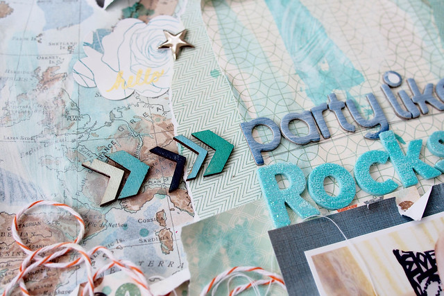
1. Tear a few pieces of 6x6 papers from the paper pad (this is easy as all the papers are coordinated)
2. Crush, tear and distress them to create texture (don't even need foam dots to pop it up)
3. Layer them on a piece of cardstock
4. Once you are happy with the arrangement of the papers, apply adhesive but you don't need much to glue the papers because you want them to look like they just lay on the card stock randomly.
5. Add photos, embellishments and stamping.
6. Ta-dah! A layout that has a lot of textures and patterns, plus a tiny bit of mixed media.

Love love these exclusive wood veneers in August kits. I painted it with Prima Chalk inks to match the color of my baby's bumbo seat. Painting the wood veneers in coordinating colors is one of my favorite ways of using wood veneers.

Tips: Add some twine (that come with the packaging of the monthly kit) and some white thread under the photo or cluster of embellishment would add more textures to the layout. I also white-washed the 'ampersand' sticker with Distress Paint in picket fence (white) to tone down the black color.

White washing the basic grey alphabet stickers too. And addes a splash of blue & teal color to the background with distress stains. Oh by the way, the title is inspired by my baby's starry pants and the photo was taken before we had a scrapbooking crop at home. Love how the star stickers in the kit matched with his pants so well.

I hope you have fun making a quick layout using the tips above. I did mine under an hour ;) Thanks for looking and have a great day ahead!
XoXo


Oh, what a cute, happy baby!!! Adorable photo. Lots of great techniques on your page, too.
ReplyDeleteGreat job Sam!! XXXXX Jennifer
ReplyDeleteparty baby! :)
ReplyDeletethumbs up for this layout Sam...love the techniques and also the cuty photo. anyway really want to see your prima layouts
ReplyDeleteI love it! The whitewashing turned out great and the distressed papers are awesome. What an adorable picture to scrap, too!
ReplyDelete