In October, I have set a challenge for myself to try to more scrap multi-photos layout. I have always scrapped at least 2 photos layout when I started scrapbooking. And as I scrap more and collected more and more embellishment, I tend to scrap more single photo layout so that I could squeeze in more embellies and play with different technique in a 12x12.
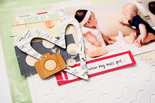
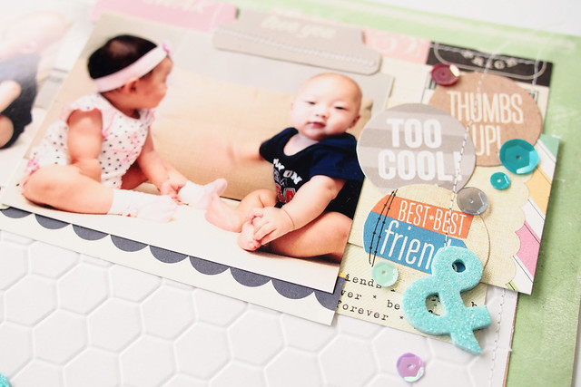
I printed 4 photos of Ivan and Vivi first meet-up and decided to place all in a layout. I wanted to scrap a double-pager but the thought of working on two sheets of 12x12 is really intimidating. So I browse thru various galleries and inspired by an awesome layout by Jina Jean for Wrtie.Click.Scrapbook October Gallery.
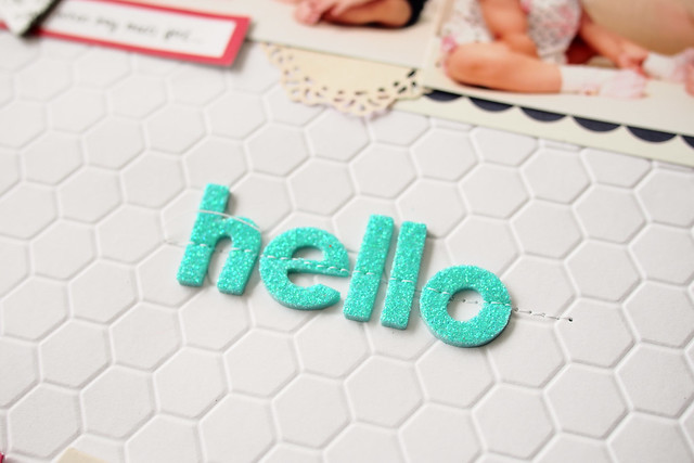
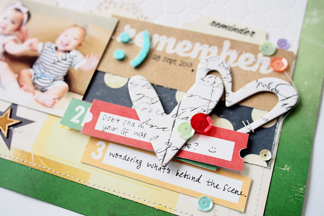
I am loving the white space in the middle. I used Craftwell Teresa Collins Honeycomb embossing folder to add some fun yet subtle texture to the white space.
Hello is my 'unofficial' one-little-word for year 2013. This is so apt since the photos were taken when the two babies first met.
I actually created this layout from all my leftover kits from - Citrus Twist Kits, Elle's Studio and Scraptastic. I am just using whatever I could reach within my arm length and also random scraps. It is fun to let the products inspired me when Mr Mojo dropped by to visit me!
This is one of my favourite layout just because:
1. The photos are simply too cute
2. I am loving the white space despite having 4 photos on a layout
3. I am in love with my eBosser - Super fun for adding texture with embossing and also die cutting!
4. I used green in this layout - not something I would normally do!
How bout you? Have you set any monthly scrapbook challenge for yourself? In November, I have challenge myself to scrap really huge photos. Huge as in bigger than 4x6 photos that I normally scrap. Let's see how it goes ;) Thanks for looking and have a great day!


GORGEOUS layout! I love the title in the middle with the white space. LOVE it!!
ReplyDeleteOh wow this is fantastic!!!!!
ReplyDeleteSo cool! Love how you managed to use the 4 pictures, the details and white space in between!
ReplyDeleteWow - I can understand you - this layout is so sweet! I love it and there are so many details but the focus is on the pictures! Phantastic!
ReplyDeleteLove this layout so so much!!!!
ReplyDeleteI love this layout! The design was really inspiring, so I scraplifted it on my project - http://michelleun.blogspot.com/2013/12/banners-and-such.html
ReplyDelete