Hello there, I am sure most of you know how much I love my eBosser! I love using it to die cut mini doilies, letters and also alphabets. I also love using it to do dry embossing / debossing to add lovely (yet subtle) texture to my pages.
So here I am sharing 3 layouts that I have made using different die cuts (with myeBosser of course!) in January. Some are valentine themed, some are just my day-to-day baby photos! Since I am sharing three pages with a few detailed shots of each page, so this is definitely a very photo-heavy post!
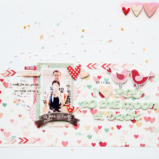
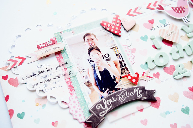
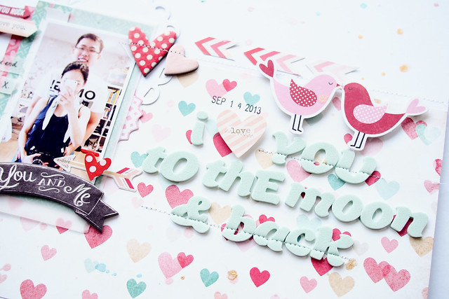
1st Layout - It is valentine-themed. God knows when was the last time I took photo of only 2 of us? I am in love with the Crate Paper Love Note collection, so made an effort to search for a photo of us from my 12k photos iPhone library. The paper is a little too busy with multi colour hearts so I mat the photo with a lace heart doilies. This is die cut with lifestyle craft dies and eBosser. I love how the heart peeks out from behind.
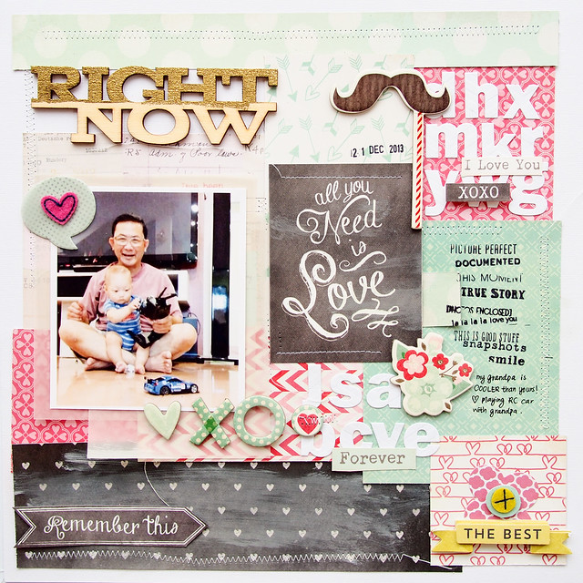
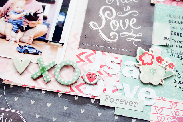
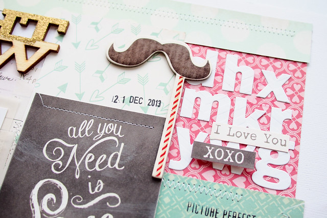
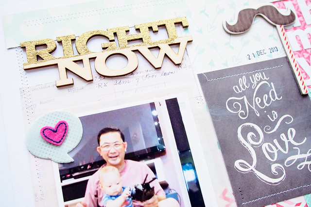
2nd Layout: Using a lot of goodies from my Made With Love DT kit - it has mix of products from Crate papers, My Minds Eyes and Fancy Pants. Chalkboard is still in the trend now. I made the chalk board paper a little more chalkish by rubbing my white distress paint over. It sort of toned down the dark black colour a little. Love love love this photo of Ivan having fun with my dad, playing remote control car. Okay, he doesn't know how to control the car but he knows how to turn the knob of the control! This is one of the layout that I want to use up all the scrap bits - papers from Crate Paper Love Note collection and also random die cut letter. I arranged the letters randomly just to fill up the space, it does not form any words here. I just want some white embellishments to tone the hot pink paper down.
I embossed the word RIGHT with gold embossing powder but it doesn't turn out as good as I expected. Again, I would just leave it as it is ;p
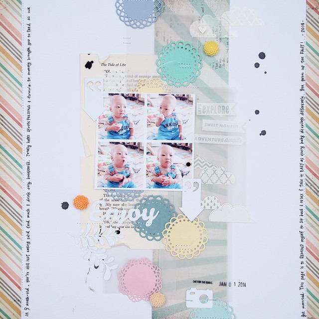
And here's the 3rd layout: Enjoy. A layout that I made to remind myself to enjoy Ivan's babyhood, to remind myself not to compare him to other babies / their growth chart / milestone. Ivan had not been eating solid much, he was either gag or vomit whenever we fed him. I got really worried and brought him to the paediatrician a few times and even got scolding for the doctor! And guess what? 3 week after this layout been made, he is eating solid food 4 times a day! Guess he is catching up after been sick for a week plus.
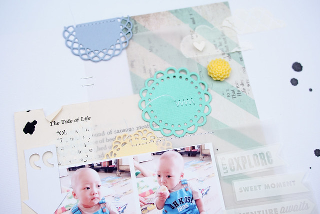
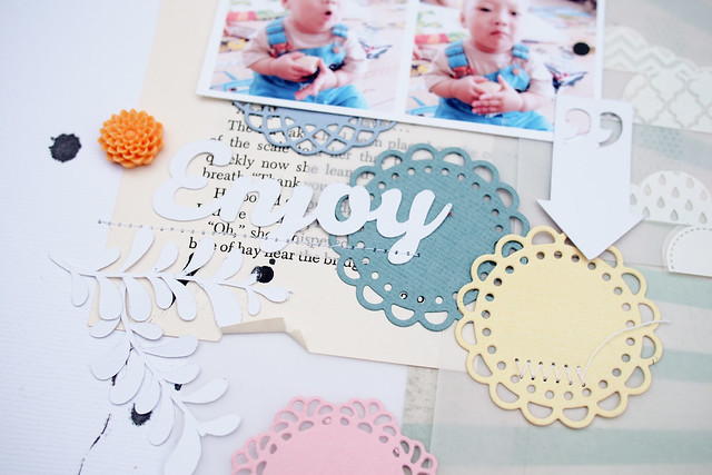
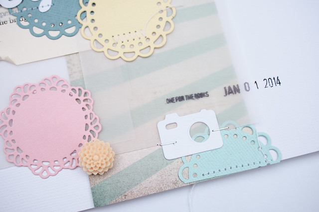
One night, I had the urge to die cut a tonnes of mini doilies. Instead of reaching for my usual white card stocks, I decided to cut those doilies with various colour card stocks. When I am done, I love all the pastel doilies and want to make them the feature of this layout. So I sprinkled them all over the page. I noticed I either like to arrange my repeated elements horizontally or vertically. For this page, I arrange the doilies in vertical arrangement and this layout came together so quickly.
Old book papers are my favourite papers for matting a photo nowadays. And I also love to add either grey or black paint splatter to my page. I like how it lead your eyes to the page. But my lovely hubster commented that it makes the page looks mouldy. I just brush him off saying you aren't artsy enough to understand my paint splatter >_<
Its a doilies madness layout eh? I also added some die cuts that I cut with my Cameo - the title Enjoy , the arrows and the branches are from my Cameo.
Cute camera die cut from My Favourite Things Die-namics and my eBosser.
Oh by the way, I had just take photos of my freshly cleaned scrap room. Will definitely do a post to bring you girls around my room! Stay tuned! XO

Beautiful work Sam! The second one is my favorite! I love how you used distress paint to tone down the black and make it look like a chalkboard! Very clever!
ReplyDeleteYour layouts are stunning!
ReplyDelete