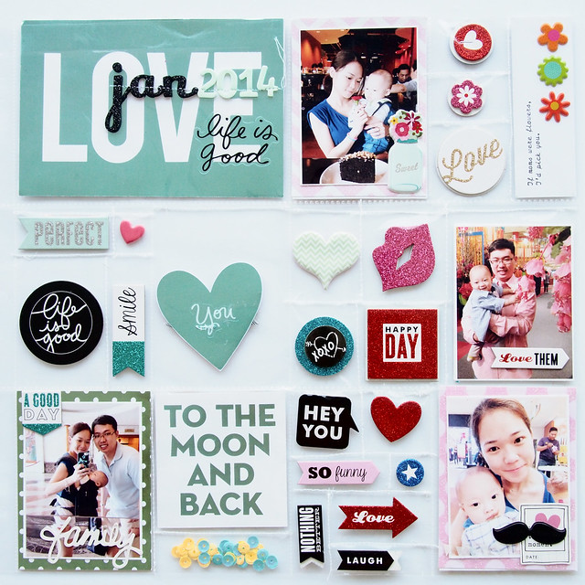
And here'd the front page. Many of these pockets has a lot of space and I photo'd them on top of a piece of white mounting board. I make more blue/teal on the left and more red/pink on the right.
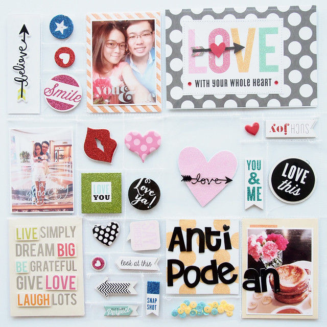
And here's the back: I just go with the flow for the colour coordination since it is quite hard to find matching size for those mambiCHIPS.
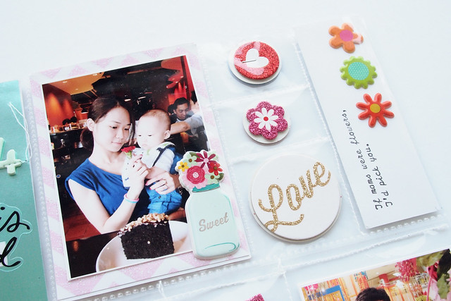
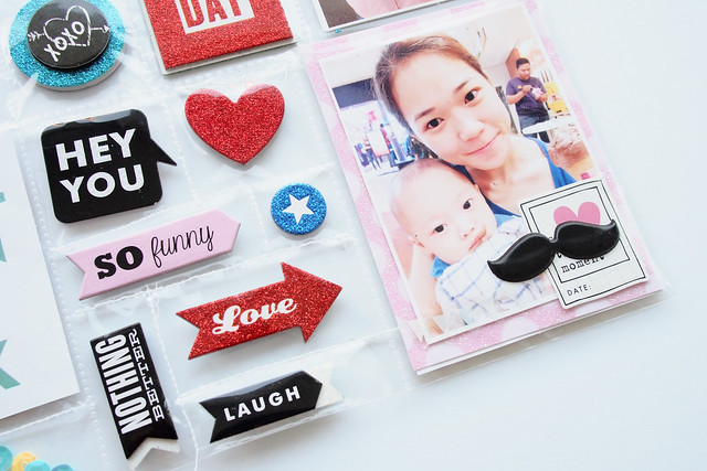
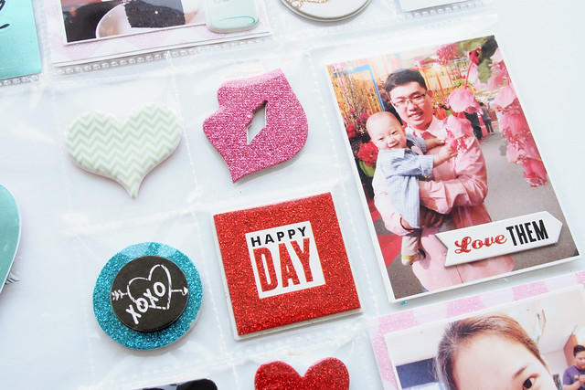
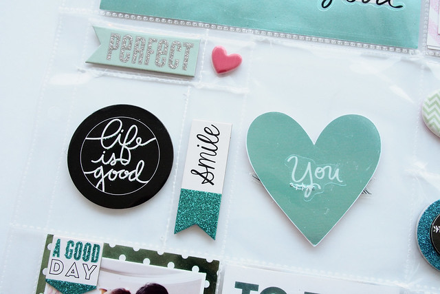
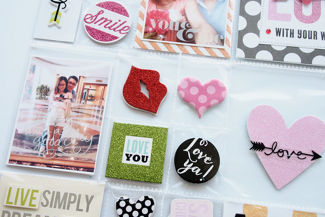
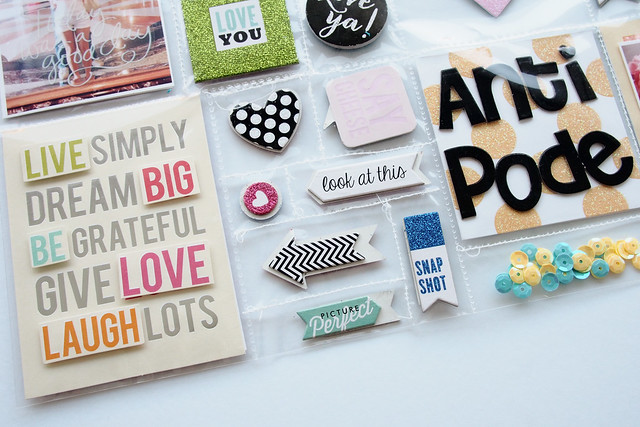
More close-ups: my machine stitching is messy. It is really hard to stitch these plastic pockets and also I am very skillfull with my beloved sewing machine.
TIPS for taking photo of your Project Life pages:
It was really hard to avoid the glare of the pocket sleeves but luckily the photo of these Pocket Pages turn out OKAY. I normally place my PL cards on top of the plastic sleeve so that the cards would have more dimension and also I do not have to deal with the glare. For this spread, I actually photo around 6pm, just before the sun sets and the sky was still bright - Glad that it works for me!
XoXo ;)



So cute!!
ReplyDeletevery cute! love how you stitched the pocket pages to include the embellishments in their own little pocket :)
ReplyDeleteWow - this is amazing and I really love your stitching - mine is also not perfect...but it is ok...I love it!
ReplyDelete